Diagrams for multivariate data
TODO
psychcor.plot()
Install required packages
car, ellipse, lattice, mvtnorm, rgl
wants <- c("car", "ellipse", "lattice", "mvtnorm", "rgl")
has   <- wants %in% rownames(installed.packages())
if(any(!has)) install.packages(wants[!has])
3-D data
Contour plots
mu    <- c(1, 3)
sigma <- matrix(c(1, 0.6, 0.6, 1), nrow=2)
rng   <- 2.5
N     <- 50
X     <- seq(mu[1]-rng*sigma[1, 1], mu[1]+rng*sigma[1, 1], length.out=N)
Y <- seq(mu[2]-rng*sigma[2, 2], mu[2]+rng*sigma[2, 2], length.out=N)set.seed(123)
library(mvtnorm)
genZ <- function(x, y) { dmvnorm(cbind(x, y), mu, sigma) }
matZ <- outer(X, Y, FUN="genZ")contour(X, Y, matZ, main="Contours for 2D-normal density")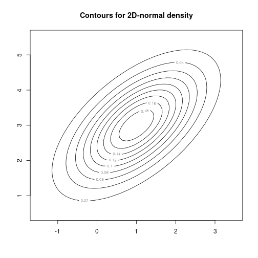
filled.contour(X, Y, matZ, main="Colored contours for 2D-normal density")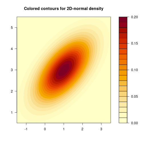
Bubble plot et c.
N      <- 10
age    <- rnorm(N, 30, 8)
sport  <- abs(-0.25*age + rnorm(N, 60, 40))
weight <- -0.3*age -0.4*sport + 100 + rnorm(N, 0, 3)
wScale <- (weight-min(weight)) * (0.8 / abs(diff(range(weight)))) + 0.2
symbols(age, sport, circles=wScale, inch=0.6, fg=NULL, bg=rainbow(N),
        main="Weight against age and sport")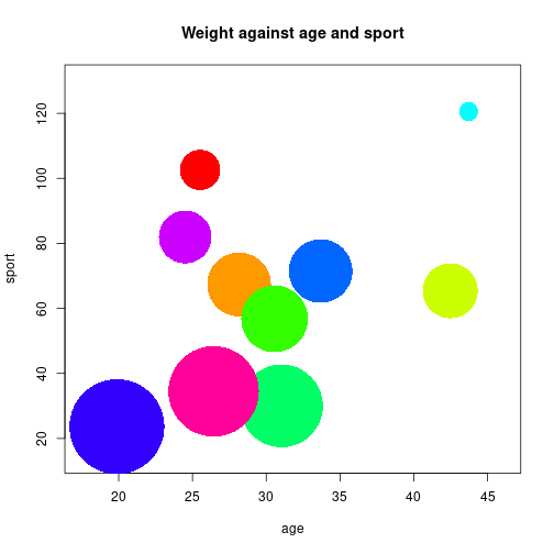
See sunflowerplot() and stars() for altenative approaches.
3-D grid plot
par(cex.main=1.4, mar=c(2, 2, 4, 2) + 0.1)
persp(X, Y, matZ, xlab="x", ylab="y", zlab="Density", theta=5, phi=35,
      main="2D-normal probability density")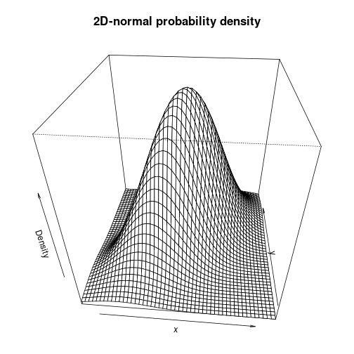
Interactive 3-D scatter plot
library(rgl)
vecX <- rep(seq(-10, 10, length.out=10), times=10)
vecY <- rep(seq(-10, 10, length.out=10),  each=10)
vecZ <- vecX*vecY
plot3d(vecX, vecY, vecZ, main="3D Scatterplot",
       col="blue", type="h", aspect=TRUE)
spheres3d(vecX, vecY, vecZ, col="red", radius=2)
grid3d(c("x", "y+", "z"))
demo(rgl)
example(persp3d)
# not shown
Conditioning plots
Njk    <- 25
P      <- 2
Q      <- 2
IQ     <- rnorm(P*Q*Njk, mean=100, sd=15)
height <- rnorm(P*Q*Njk, mean=175, sd=7)
IV1    <- factor(rep(c("control", "treatment"), each=Q*Njk))
IV2    <- factor(rep(c("f", "m"), times=P*Njk))
myDf   <- data.frame(IV1, IV2, IQ, height)
coplot(IQ ~ height | IV1*IV2, pch=16, data=myDf)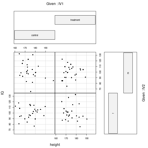
library(lattice)
res <- histogram(IQ ~ height | IV1*IV2, data=myDf,
                 main="Histograms per group")
print(res)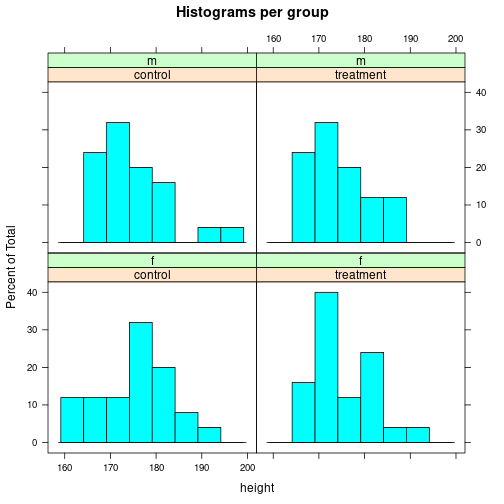
Scatterplot matrices
N      <- 20
P      <- 2
IV     <- rep(c("CG", "T"), each=N/P)
age    <- sample(18:35, N, replace=TRUE)
IQ     <- round(rnorm(N, mean=rep(c(100, 115), each=N/P), sd=15))
rating <- round(0.4*IQ - 30 + rnorm(N, 0, 10), 1)
score  <- round(-0.3*IQ + 0.7*age + rnorm(N, 0, 8), 1)
mvDf <- data.frame(IV, age, IQ, rating, score)pairs(mvDf[c("age", "IQ", "rating", "score")], main="Scatter plot matrix",
pch=16, col=c("red", "blue")[unclass(mvDf$IV)])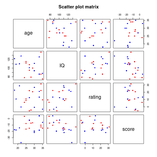
myHist <- function(x, ...) { par(new=TRUE); hist(x, ..., main="") }
myEll  <- function(x, y, nSegments=100, rad=1, ...) {
    splLL <- split(data.frame(x, y), mvDf$IV)
    CG <- data.matrix(splLL$CG)
    TT <- data.matrix(splLL$T)

    library(car)
    dataEllipse(CG, level=0.5, col="red",  center.pch=4,
                plot.points=FALSE, add=TRUE)
    dataEllipse(TT, level=0.5, col="blue", center.pch=4,
                plot.points=FALSE, add=TRUE)
}pairs(mvDf[c("age", "IQ", "rating", "score")], diag.panel=myHist,
upper.panel=myEll, main="Scatter plot matrix", pch=16,
col=c("red", "blue")[unclass(mvDf$IV)])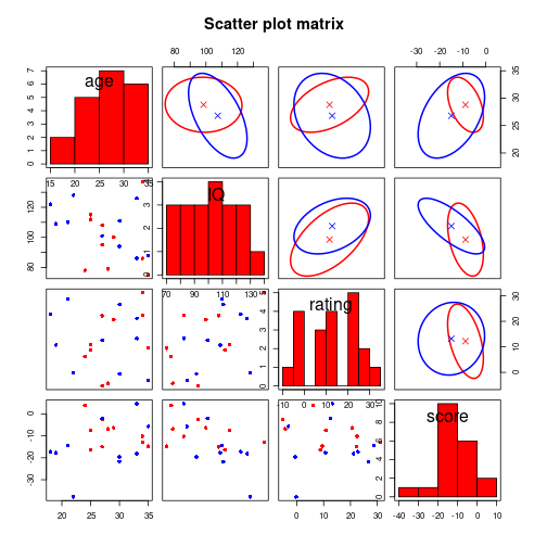
Heatmap
Illustrating the correlation matrix of several variables.
library(mvtnorm)
N <- 200
P <- 8
Q <- 2
Lambda <- matrix(round(runif(P*Q, min=-0.9, max=0.9), 1), nrow=P)
FF <- rmvnorm(N, mean=c(0, 0),   sigma=diag(Q))
E  <- rmvnorm(N, mean=rep(0, P), sigma=diag(P)*0.3)
X  <- FF %*% t(Lambda) + E
corMat <- cor(X)
rownames(corMat) <- paste("X", 1:P, sep="")
colnames(corMat) <- paste("X", 1:P, sep="")
round(corMat, 2) X1 X2 X3 X4 X5 X6 X7 X8
X1 1.00 -0.37 0.17 0.11 -0.11 -0.34 -0.04 -0.43
X2 -0.37 1.00 -0.13 0.11 -0.05 0.57 -0.17 0.39
X3 0.17 -0.13 1.00 0.63 -0.62 -0.03 -0.51 -0.44
X4 0.11 0.11 0.63 1.00 -0.79 0.13 -0.64 -0.40
X5 -0.11 -0.05 -0.62 -0.79 1.00 -0.12 0.64 0.45
X6 -0.34 0.57 -0.03 0.13 -0.12 1.00 -0.28 0.38
X7 -0.04 -0.17 -0.51 -0.64 0.64 -0.28 1.00 0.23
X8 -0.43 0.39 -0.44 -0.40 0.45 0.38 0.23 1.00image(corMat, axes=FALSE, main=paste("Correlation matrix of", P, "variables"))
axis(side=1, at=seq(0, 1, length.out=P), labels=rownames(corMat))
axis(side=2, at=seq(0, 1, length.out=P), labels=colnames(corMat))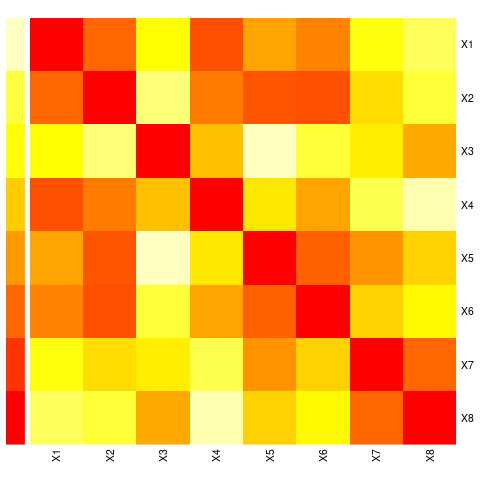
See heatmap() for a heatmap including dendograms added to the plot sides and correlation for an alternative approach to visualize correlation matrices.
Correlation matrix plot
library(ellipse)
plotcorr(corMat, type="lower", diag=FALSE, main="Bivariate correlations")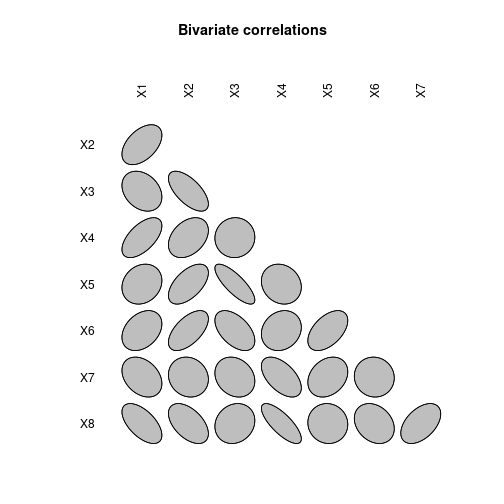
Useful packages
- See package
tourrfor an alternative to visualizing high-dimensional data. - Packages
ggplot2andlatticeprovide their own graphics system and many functions for multi-panel plots. - Packages
rggobi, andplaywithalso create interactive diagrams. - Packages
googleVis,ggvis, andrChartscreate online interactive diagrams based on JavaScript libraries.
Detach (automatically) loaded packages (if possible)
try(detach(package:car))
try(detach(package:ellipse))
try(detach(package:mvtnorm))
try(detach(package:rgl))
try(detach(package:lattice))
Get the article source from GitHub
R markdown - markdown - R code - all posts