Format ggplot2 diagrams
Install required packages
wants <- c("ggplot2", "colorspace")
has   <- wants %in% rownames(installed.packages())
if(any(!has)) install.packages(wants[!has])
Simulate data
Data needs to be in long format.
Njk    <- 50
P      <- 3
Q      <- 2
IQ     <- rnorm(P*Q*Njk, mean=100, sd=15)
height <- rnorm(P*Q*Njk, mean=175, sd=7)
rating <- factor(sample(LETTERS[1:3], Njk*P*Q, replace=TRUE))
sex    <- factor(rep(c("f", "m"), times=P*Njk))
group  <- factor(rep(c("control", "placebo", "treatment"), each=Q*Njk))
sgComb <- interaction(sex, group)
mood   <- round(rnorm(P*Q*Njk, mean=c(85, 80, 110, 90, 130, 100)[sgComb], sd=25))
myDf   <- data.frame(sex, group, sgComb, IQ, height, rating, mood)
Control element position
Side-by-side = “dodge”
library(ggplot2)
ggplot(myDf, aes(x=mood, fill=sex)) +
    geom_histogram(aes(y=..density..), position=position_dodge())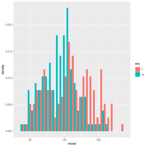
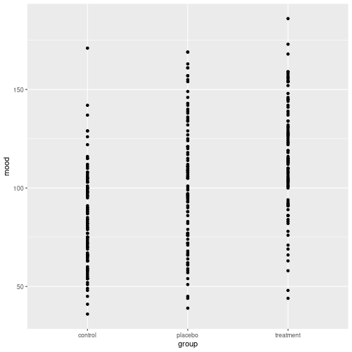
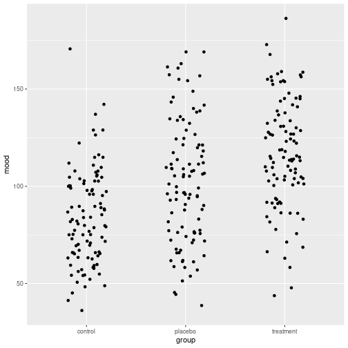
Random jitter - useful for overlapping points, e.g., when variables are integer.
ggplot(myDf, aes(x=rating, group=sex, fill=sex)) +
    geom_bar(stat="count",
             aes(y=(..count..) / sum(..count..)),
             position=position_fill())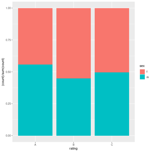
Format axes
Change order of categories by changing order of factor levels.
[1] "A" "B" "C"levels(myDf$rating) <- rev(levels(myDf$rating))
ggplot(myDf, aes(x=rating, group=sex, fill=sex)) +
geom_bar(stat="count",
aes(y=(..count..) / sum(..count..)),
position=position_fill()) +
labs(x="Rating category", y="Cumulative relative frequency")
Rotate x-axis labels and fine tune x-axis limits / breaks.
ggplot(myDf, aes(x=height, y=mood, colour=sex, shape=group)) +
    geom_point(size=3) +
    scale_x_continuous(limits=c(150, 200),
                       expand=c(0, 0),
                       breaks=seq(150, 200, by=5)) +
    scale_y_continuous(n.breaks=8) +
    guides(x=guide_axis(angle=90))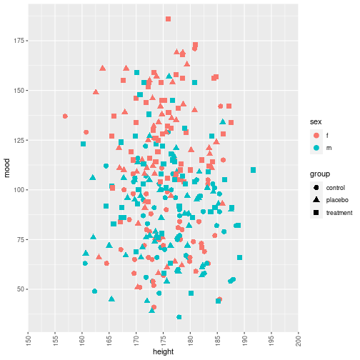
Flip x- and y-axis
Format legend
ggplot(myDf, aes(x=height, y=mood, colour=sex:group, shape=sex)) +
geom_hline(aes(yintercept=100), linetype=2) +
geom_vline(aes(xintercept=180), linetype=2) +
geom_point(size=3) +
geom_smooth(method=lm, se=TRUE, size=1.2, fullrange=TRUE) +
facet_grid(sex ~ group) +
labs(title="mood ~ height stratified by sex + group") +
geom_text(aes(x=190, y=70, label=sgComb),
size=7, hjust="right", show.legend=FALSE) +
annotate("text", x=165, y=35, size=7, label="Annotation") +
guides(shape="none") +
theme(legend.position="bottom")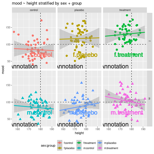
Format color, shape and line type
sex group mood
1 f control 84.28
2 m control 84.04
3 f placebo 117.22
4 m placebo 87.06
5 f treatment 130.40
6 m treatment 103.38ggplot(groupM, aes(x=group, y=mood, color=sex, shape=sex, group=sex)) +
geom_point(size=8, stroke=2) +
geom_line(size=2, linetype="dashed") +
scale_shape_discrete(solid=FALSE)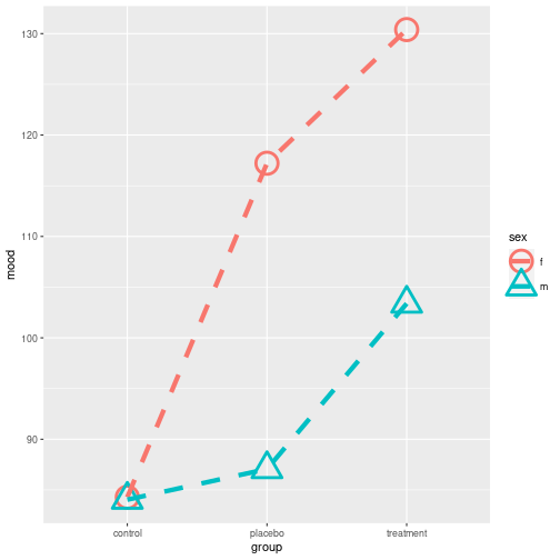
ggplot(myDf, aes(x=mood, fill=group)) +
geom_histogram(aes(y=..density..), alpha=0.5) +
geom_density(alpha=0.7) +
scale_fill_discrete_qualitative()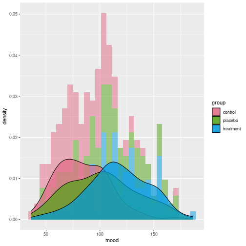
Use themes for a collection of pre-set formatting choices.
ggplot(myDf, aes(x=mood, fill=group)) +
geom_histogram(aes(y=..density..), alpha=0.5) +
geom_density(alpha=0.7) +
scale_fill_discrete_qualitative() +
theme_bw()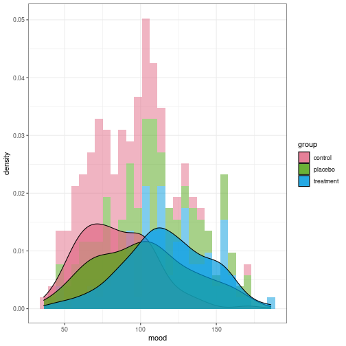
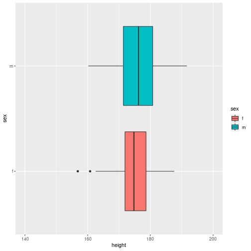
ggplot(myDf, aes(x=sex, y=height, fill=sex)) +
    geom_boxplot() +
coord_flip(ylim=c(140, 200)) +
theme_minimal()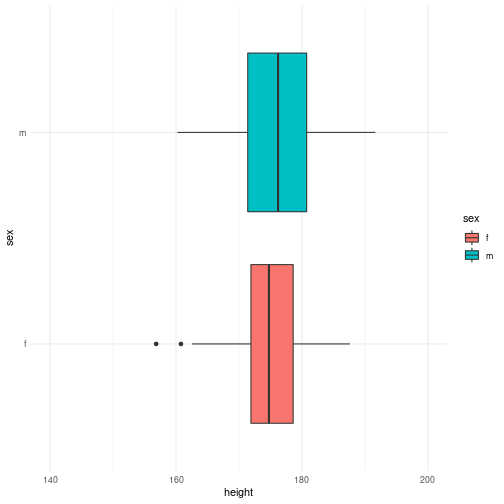
Further resources
See Cookbook for R: ggplot2 diagrams for many detailed examples of ggplot2 diagrams.
Detach (automatically) loaded packages (if possible)
Get the article source from GitHub
R markdown - markdown - R code - all posts